Gathering information about potential and existing customers plays a key role in inbound sales and...
Forms seem to dominate the internet these days. You can't visit or scroll through a website without a pop-up asking if you'd like to join a newsletter or get marketing activities straight to your inbox.
For your users, it can be exhausting to navigate the endless 'sign up now' or the less subtle 'no, I don't want these amazing offers' CTA buttons. While these single field 'email address' forms work perfectly well for the aforementioned newsletter sign-ups, what if you want something more for your website?
Maybe you want your user to sign up via a long registration form? Or do you want to onboard them with a form? You're going to need something specific to do all of that. Getting a HubSpot custom form built by a developer is an option, but you could be waiting weeks and you'll end up paying extra for the pleasure.
What are the alternatives?
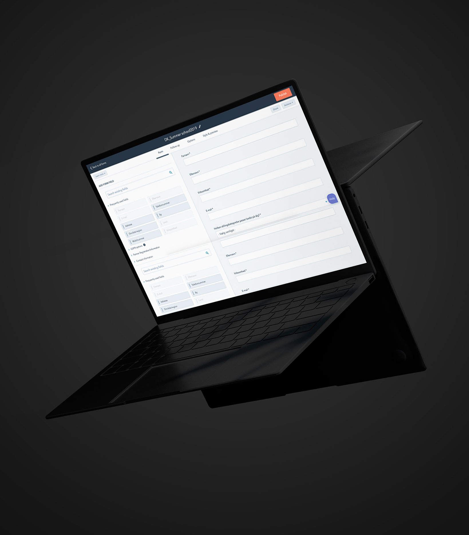
HubSpot offers a free online form builder, allowing you to create forms that connect with your contacts' database. With a potential for over 1,000 form fields, the builder gives you the option of a dozen different field types, like text, dropdown, radio select, check box and more.
The drag-and-drop functionality also means these forms are easy to set up for anyone without tech expertise. With the premium version, you can also set up automatic emails after completion and adapt your questions to each website visitor, so you’re not showing the same questions to returning visitors.
But there's only so much customisation you can do with HubSpot's form builder. Having 1,000 fields on a single page is not only daunting for your users, but it's also a big faux-pas when it comes to web design and user experience.
Get going with ready-made modules
Many businesses, ourselves included, offer ready-made form modules to buy in the HubSpot Asset Marketplace.
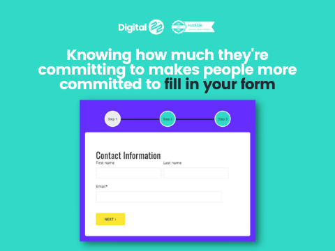
Do you really want those 1,000 fields? You can break them up with multi-step forms that'll take your users from one step to the next with ease.
With all of the fields broken down into stages, your form will be nicer to look at and it'll give you the option of adding more fields without the page looking overwhelmed.
In fact, one study found that 14% more people finished a 2-step form than a 1-step form. And if your form steps are numbered or display a progress bar, your users are more likely to see it through and increase your submission rates.

If you want your users to act quickly, use a countdown form. The sense of urgency the countdown creates is perfect for getting your users excited about events or competitions, so they're more likely to fill out the form then and there.
Or perhaps you want to do a customer survey but don’t want to link to an external website like SurveyMonkey. By keeping the user on your website with a smooth, one-question-at-a-time survey, you can gather valuable feedback while decreasing your bounce rate and engaging your users.
These fancy features not only improve your website's user experience but with ready-made form modules; you also don't need to wait for or spend money on a developer.
So the answer to the question is: you could pay for a HubSpot custom form, but with ready-made ones for a fraction of the price, why would you?
Check out our HubSpot form modules today
Still not sure? Check out the Digital 22 HubSpot Marketplace, where our ready-made form modules will get you on your way to creating a seamless experience for you and your users.
Browse the Marketplace today using the button below.


