In the inbound marketing methodology, call-to-actions are used to convert online visitors into...
When you visit a website, you expect it to be clear where you should click to move on in the buyer’s journey. No matter if you land on the front page and want to enter the blog, or if you want to read more about the company. In order to guide visitors from one page to another, we use so-called Calls-to-actions (CTAs). But what is it and how do you make CTAs that convert?
CTAs are one of the most important elements when it comes to lead generation, simply because they aim to lead the visitor to take the next step – making the lead a little warmer and a little more ready to buy.
It doesn’t really matter if your content is great unless your CTAs catch people’s attention and motivate them to click on a new, relevant content offer or website page. Before we look at how to create CTAs that increase conversion, we'll first take two steps back and dig a little deeper into what these three letters actually represent.
What is a Calls-to-action?
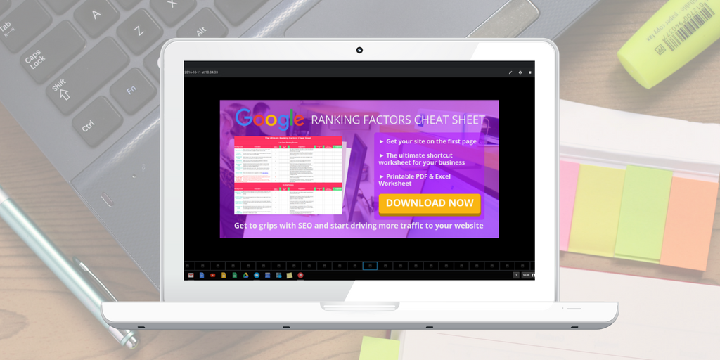
Calls-to-action, or CTA, is a text link or a button that visitors on the website can click to perform an action, such as filling out a form to download an ebook, start subscribing to the blog or go to the online store.
The CTA is, therefore, the very key to catching people's attention and encouraging them to move on in the buyer’s journey. These buttons or text links can be used in blog posts, on product pages, as pop-up ads, on social media, in newsletters – virtually anywhere where you have the opportunity to offer your content to your audience.
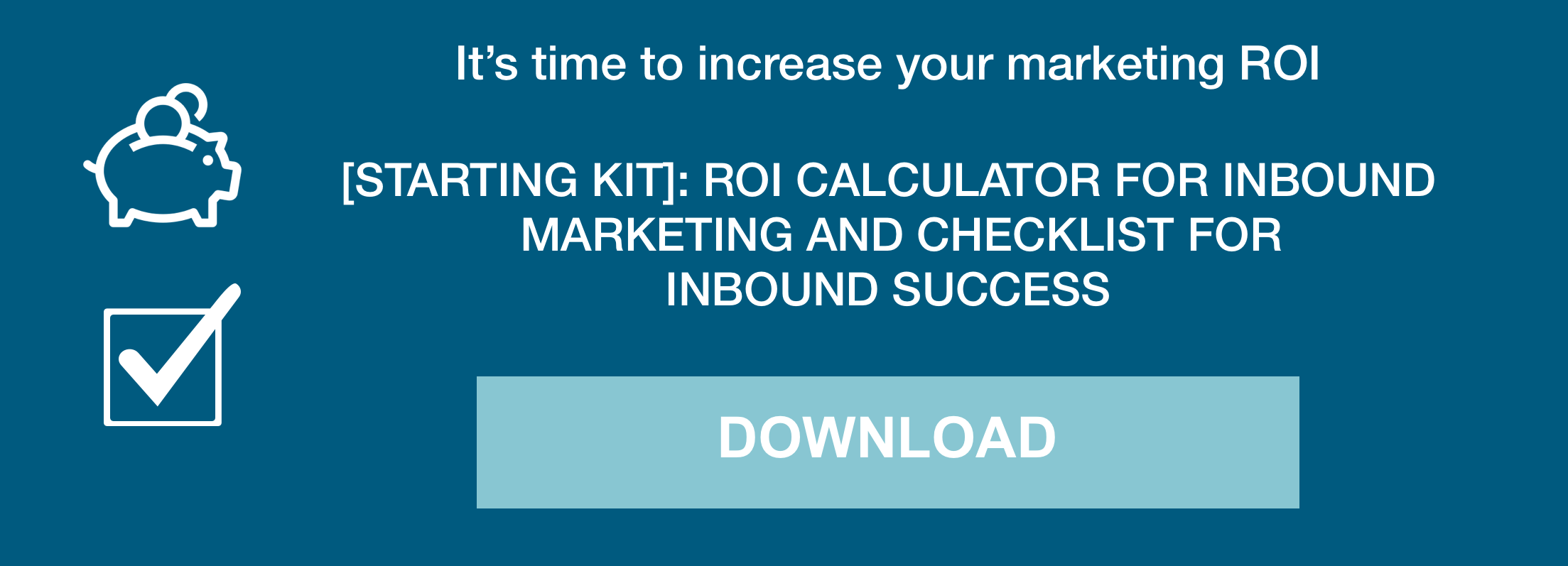
They may look very different depending on where they occur on the website. Most companies, however, use a CTA at the bottom of a blog post so that it encourages the reader to stay on the website. It may look something like this:

You should also have a CTA within the text, preferably quite early in the blog post. This way you can easily capture those readers who do not scroll down to the bottom of the blog post. To avoid having the exact same CTA two places in a blog post, this one should take less space, and maybe contain text only:

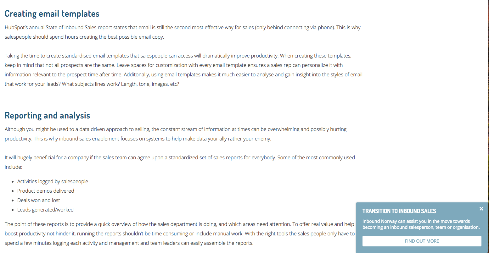
A third common use of CTA is to have so-called slide-in-CTAs that pop up in the corner of the screen or "slip in" in the middle of the text.

The most important thing to consider when creating a CTA is that it should be eye-catching, have a clear message and have both an obvious connection to the content it leads to and the content it leads the reader from.
Imagine you’re writing a blog post that explains what inbound marketing is. A good next step would then be to have a more in-depth guide to inbound marketing.
But how do you create CTAs that actually convert?
3 tips for creating CTAs that convert
1) Place the CTA in a fitting place
Naturally, you have to place the CTA where it is clearly displayed so that it immediately catches the reader's attention. Do not hide it at the bottom of a newsletter.
However, you should always add one at the bottom of a blog post. Why? Because the CTA should be a natural next step for the reader to take. This way, you keep the visitor on the website and continue to offer relevant content.
Also place CTAs on the first page of the website, on product pages, reference pages, and other static pages. There should always be at least one CTA on each page of your website so you can guide the visitor through the buyer’s journey by providing a reasonable and relevant next step.
This is simply because each part of the website has its own purpose. For example, the purpose of the "about us" page will be to convince leads that are getting ready to choose a provider, to choose just you. At that point a CTA who says "Book a meeting in my calendar" can be good.
On the product page, there should be a CTA that help the hottest leads complete the purchase, such as "Add to Cart" or "Order Here". It may also make sense to include other alternatives that are more of an interest to those leads that aren’t yet ready to buy but are more interested in reading a case study about someone that has achieved great results after investing in your product or service.
Take a look at your website. Do all pages have a purpose and are there a clear path for those visiting the site?
2) Express yourself clearly – not smart
When you write out the text that are to be on the button, or the text to be linked, it may be tempting to come up with something funny or clever to sell the message. Therefore, always think: clear rather than smart.
By that, we mean that the message should be clear and specific. For example, if you want the reader to download the guide to inbound marketing, write something like "Download" or "Get Free Guide."
If you manage to communicate the value the reader will get by clicking your CTA, that’s even better. It may look something like this: "Get a thorough introduction to inbound marketing and find out if it suits your business."
3) Test and see what actually works
There’s no universal formula for creating the perfect CTA. What works well for some businesses might not necessarily work well for others. Fortunately, you can test and experiment to create a CTA that gives high results – and continue to tweak it until it is near perfect.
A so-called split test or an A / B test is simply a method of testing two different versions of an element – such as a CTA – against each other so that you can see which version gives the most conversions.
Run the two versions in parallel so that half of the visitors view version A and the other half version B. This is a great way to collect statistics about which version works best. Once you've found the winner, there's only one thing left to do: keep on using it (and never stop testing for continuous optimisation).
You can basically test all the elements of your CTA: the header, body text, the text of the button and the colour, structure, design, location on the page, and so on. Remember to only test one thing at a time so that you know which element made a difference to the result.


