Here is the ultimate web page layout best practices checklist. We're going to go over every element of your page then you can design it effectively for online visitors who land on your site. The layout of your web pages will influence how successful your conversion rate will be. So, what's the best way to design the layout of your web page?

1. Think about your audience
Before you start speaking to your web developers and designers about how you want your site constructed, you need to think about your audience. What will they want from your site?
Creating an incredible navigational experience is key for Millennial customers. Generation Z's, on the other hand, are more focused on the product.
Think about your ideal customers who will be coming to your site. Will they want a fancy web layout or will they prefer something simple?
Create a detailed profile of your buyer personas to help you plan the layout and choose features that will interest your ideal buyers and convert them into customers. This is an important step you shouldn't skip!
Feel free to use our own Persona template to note your ideas and increase your understanding of your ideal customers:
Once you understand your audience you can plan the layout of your site.
2. Compressed Images
If your ideal audience appreciates large scale and eye catching images you need to be careful you don't sacrifice your site speed in the process.
Your images need to be visually attractive - they are important in keeping your online visitors on your site.
Images should be unique and high quality too.
Having big images can greatly reduce your load speed and that's bad news for your conversion rate. The longer a person has to wait for a page to lead, the higher the chance they will leave the page (and likely go to your competitor's site).

JPEG is the best image format for sites and when it's compressed it doesn't lose its high quality. Compressing your images will give your online visitors high quality images AND a faster load speed.
3. Clear content layout
Once again, go back to your ideal buyer persona. What is the best way to deliver content to them?
Would they prefer content to be displayed in the middle of the page and surrounded by white space and no distractions? Or, do they want less content and more images?
When you know what they'd prefer, you can think about font spacing and style.
An important rule of thumb you should follow when it comes to content layout is to always check how it looks on a mobile device. More people are using their mobiles and tablets to quickly access the internet. If your pages aren't mobile optimised or they're awkward to read, you need to fix it.
Your site should be accessible and easy to navigate on any device.
4. Don't clutter - Use whitespace
Many websites fill their pages with too many images, content, CTAs and links. It's understandable why people want to fill the whitespace. It's your natural instinct to fill all spaces of your web page - however you need to resist that instinct.
According to a recent study, humans have an attention span of 8 seconds, thanks to smart phones.
You can't have too many distractions on your page. In fact, your web page layout needs to be carefully designed on the Buyer's Journey to help navigate your ideal buyers.
Use white space to keep your visitor's attention on the important features of your site.

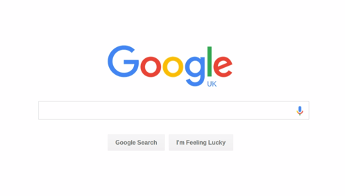
Take inspiration from Google's Search page. No distractions.
5. Install CTAs appropriately
As your web page layout is working to convert visitors into customers, it's important to have relevant CTAs in place.
But going back to the previous point, you need to be careful not to clutter your pages with too many CTAs.
Only use relevant CTAs on relevant pages. Incorporating your CTAs in your content will help encourage visitors to act. Avoid having many CTAs on the side bars of your web pages, they will just be regarded as annoying adverts.
6. Consistency is key
Have you ever been navigating through a website and come across a page that looks dramatically different from the rest of the site? You check the URL, you know you haven't been taken to another site. But you're disorientated. And you just want to go back to the last page you were on.
Consistency is important for your website page layout, you should have the same or similar layout for your pages. Design themes should be the same to avoid disrupting your visitor's navigational path.
7. Always remember your ideal buyer personas

As your website grows, it's easy to forget about your buyer personas. But they should always be at the core of your strategies.
Your design and your layout should be engaging for your ideal customers. They need to be engaged with how your site is presented and be encouraged to stick around.
If you have time to do additional market research, A/B testing can give you the opportunity to find out what your ideal buyers like and which they would prefer.
As an inbound marketing agency, our marketing strategies are created from our ideal buyer persona profiles we create. Once you understand the needs of your ideal customers, you can create a web page layout that will engage with them.
Improve your conversion rate with inbound marketing
The inbound marketing methodology is designed to help you understand your target market and create effective strategies that will engage with them and convert them into customers.
Learn more about how inbound marketing works with our free eBook:
What did you think of our web page layout best practices checklist? Tell us in the comments below.
Real Growth. Real Impact.
HubSpot's Spring Spotlight 2025 was not what we expected
The Power of Community in Marketing
The Return of Human Marketing in an Automated Age | Avidly Talks
How to make change projects a success - Change management tactics
How to prompt AI for great creative ideas
The Profitable Bond: Unlocking Sales Success through Stronger Customer Relationships with Director of Marketing Johanna Sjölin
HubSpot AI - Explain it to me like I'm 5
See why enterprises chooseAvidly
Let’s build your HubSpot success story
Compelling final call to action - with accompanying link to Contact page


