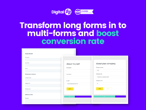
Online forms can be lengthy, complex and lacking in a good user experience. This means the visitors...
Make it load faster and the content snappier. And make the form easier to fill out. If those two things aren't done, doing them today will make your HubSpot website pages perform better. Way better.
Load your page faster and make the content snappier
Yes, page speed isn't everything all of the time. Sometimes, pages are better being loaded a bit slower (in context, obviously). And having a tiny amount of words on a page sometimes isn't possible when you're explaining a complex B2B process or solution.
It's cool.
But, you can make a couple of improvements today in relation to both of these things that will help improve your HubSpot website pages.
First, reduce the size of your images
Doing this will help your HubSpot page load faster by shaving vital seconds off your load time (depending on the original file size of images and the user's connection, this could be in double figures).
But what's more crucial is that your user doesn't have to experience the frustrating feeling of images loading slowly. Even if it's still "fast" but slower than what they experienced on the sites they looked at previously, it's positioning your site as inferior.
And therefore your business is, too. They'll get the minimal info they need from your site and bounce.
But having images that don't feel slow to load will help the overall user experience of your page. And make your content land more positively.
And for a bonus, get them in a format Google loves like WebP.
Second, get your copy editor hat on
I guarantee that the copy on your page would benefit from a facelift. A nip. A tuck. A brutal attack with a pair of sharp scissors that cuts out all the crap and leaves only the good stuff on the page.
Make it snappy and make it about the reader.
Cut the waffle.
Any sentence which doesn't add direct value to the user OR move them further into their research journey/next steps: cut it out.
You wanna see that backspace getting some real hammer on this copy review. Nobody is reading hundreds of words in lengthy paragraphs about your business, your processes or your years of experience.
Change the focus to be on your target persona. Use "you" 100x more than you use "we" or "us" and you'll speak to your reader rather than talk at them.
Use analogies they can relate to.
Nothing revolutionary here — it's time to put in the hard work and revisit the copy rather than leaving it on the bottom of your to-do list.
Make it easier for people to fill in your form
Uncertainty breeds doubt. Doubt breeds fear. Fear breeds poor page conversion rates.
People who are afraid of exactly what they're filling in a form for, how long it'll take or how much information is required to be shared are less likely to convert on a page.
It's a simple fact. You know this. But how do you overcome it?

Break any form that's longer than just your name and email into a multi-step process that has:
- Clear signposting so they know where they're at in the process
- A design that complements your page, so it feels natural and at home
If you can chop your forms into easy steps like that, you'll get more people converting than you do currently.
Next steps: Tools to help do these things (or tl;dr)
Get those images resized and break that form into manageable steps.
- Resize your images using Kraken.io
- Review your copy manually and by using great tools like Grammarly and HemingwayEditor
- Install a HubSpot Form which uses multiple steps
Check out the form in action on our marketplace page and then install it today, so your following HubSpot report looks a lot healthier using the button below.


