9 Reasons Heatmap Analysis Is An Essential Part Of Modern Web Design
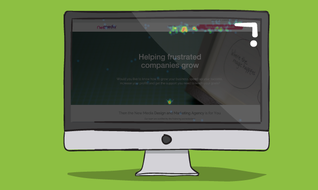
It’s great for visual analysis and much more - especially when coupled with other analytical tools, in particular eyetracking heatmaps and A/B user testing. So, let’s get into it.
1. It gives quick page design analysis
Given the visual presentation of the results, it offers an instant way to analyse which parts of your page(s) are drawing clicks.
If that call-to-action isn’t getting any or enough clicks, you can get straight to redesigning, replacing or relocating it somewhere else on the page.
Try putting the object in question to the left (statistically the most focussed on area of a page) or next to your most clicked on navigation feature.
If you’ve found which parts of your page are unsuccessful (read, ‘pointless’) now do something about. On the flip side, it shows you what people enjoy too - you can then do more of this on other pages.

2. It's also cheap
Given the number of free trials and accounts available, it’s a good way to get an initial insight into using heatmaps. The paid-for “pro” options are also very cost effective too, especially when you consider the amount of data generated and how easily usable it is with the results from A/B testing.

3. It shows scroll and hover behaviour
Many heatmap analysis tools also monitor user scrolling and cursor hover behaviour. Looking at this can give you an insight into key design features of your site. The more red indicates almost 100% of people visited that area of the page. The more yellow/green the colour becomes, it means less people got to this point of the page.
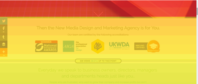
See how often people scroll all the way to the bottom. See how long they spend reading your content by analysing the hover data. And most importantly, see where they scroll and hover before moving onto another page or somebody else’s site.
You can shorten and adapt your content and layout accordingly.
4. Filter Data Into Different Audiences
The data produced from heatmaps can be categorised and filtered to work out how your audience uses your site at different times of the day, on different pages, or when viewing different types of content.
Tracking this through, you could see when more conversions happen and deduce that the behaviour of visitors at said time is more productive. Is it the audience which spends time browsing slowly, reading every word and scrolling all over the page before heading back to the navigation bar? Or is it the audience that quickly skims and hits the navigation to the page they’re after?
As you can see here, were have data on where the most recent visitors are from, how long they spent on each page, and what their activity actually involved.
Whichever it is, that’s your audience to target. Make sure your design is perfect for them.

5. Even Having No Discernable Data Can Be Used
If your users produce a pretty “cold” heatmap - spreading their clicks pretty evenly all over every available port of call - you are probably offering too much choice so people aren’t being directed anywhere in particular.
Like wandering around a gathering at a great country house, trying all the different doors hoping to find a cluster of people having a party - before giving up and going next door, where the welcome signs and easy to follow music let you know where you need to be.
6. It Means You Can Begin To Sharpen The Buyer's Journey
Following on from that, once you’ve sharpened up your user’s experience through and around your site, you can shorten the buyer’s journey and drive more conversions.
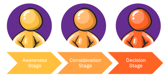
Internet users are often strapped for time, especially when it comes to eCommerce, so your site needs to offer a rewarding and stress free experience.
Using heatmaps to sharpen up your pages so they eventually only include things that people want to click on is a great way to do this.
7. Highlights Popular Design and Imagery
Again, on the same theme, hot click areas on logos, infographics,imagery and hyperlinks of text will tell you what type of things your users enjoy engaging with.
Here you can see that we have compared two images to see which users are more likely to click on. The first image received 8 clicks and the other received 3. This tells us that the first image if more popular with our clients, and therefore we should consider using this to our advantage.

The items themselves and the knowledge gained can be applied to your social posts, emailed contacts and advertising campaigns.
8. Position and Design CTAs Effectively
Looking at heatmaps to show bypassed and popular calls-to-action allows you to make sure all of your submission boxes, add to cart buttons and any other CTAs are fully optimised to maximise conversions.
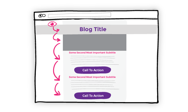
9. They Can Track Eye Focus As Well
We have been focussing primarily on click, hover and scroll tracking but it is possible to pay for user’s eye movement and focus to be monitored on your pages too.
There is an argument that this is superficial, but if used with the other variants of the tool, it can give you the full picture of how users interact with your design.
Click on this link to find out more on GDD:
Real Growth. Real Impact.
Time to rethink your whole SEO and content marketing strategy
Why it's vital and how to start building customer-led sales and marketing
How is AI disturbing Google search results and what can you do about it
How to avoid over optimising your website with Hannah Wilson, SEO Specialist
Google Search API leaks: All you need to know [LIVE BLOG]
Choosing between a HubSpot Partner and an SEO-specific agency
What's happening with Google SGE and what should we do?
See why enterprises chooseAvidly
Let’s build your HubSpot success story
Compelling final call to action - with accompanying link to Contact page


![Google Search API leaks: All you need to know [LIVE BLOG]](https://www.avidlyagency.com/hs-fs/hubfs/cloud.jpg?width=400&height=225&name=cloud.jpg)


